
OVerview
As an expat in Barcelona with a growing passion for coffee, I stumbled upon the BarcelonaCoffeeGuide. While their website was informative, it was challenging to navigate. This inspired me to embark on a UX/UI redesign project aimed at improving clarity and usability.
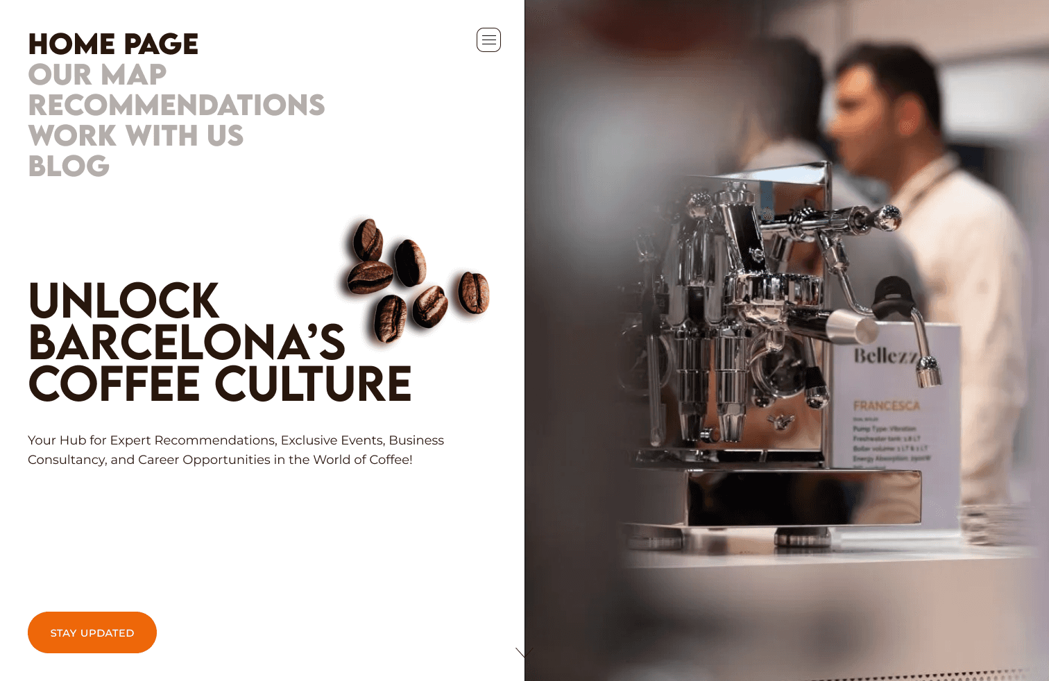
Impact
Improved Navigation: Simplified the navigation by enhancing the visibility of the subscribe button and removing unnecessary features, making the site easier to use.
Streamlined Event Access: Redesigned the events section to allow users to find details quickly without excessive scrolling.
Cleaner Landing Page: Reduced clutter and added a clear call-to-action for newsletter subscriptions, making the page more focused and user-friendly.
Enhanced Coffee Place Pages: Organised the coffee place listings with better alignment and imagery, that would lead to a more engaging and visually appealing experience.
Stronger Branding: Used vibrant colours and modern fonts to refresh the site’s look, aligning it with the brand’s identity while maintaining simplicity.
Goals
Business goals
Share events and coffee places with the community
Offer consultancy services
Encourage newsletter subscriptions
Minimize development costs.
User goals
Easily find upcoming events
Locate nearby coffee places
Connect for advice on starting a coffee business
Learn more about coffee
Research AND ANALYSIS
I conducted user testing with four individuals to assess how easily they could find specific information. While all users could locate coffee places and media features, they encountered issues with navigation, excessive scrolling, and unclear business offerings. For example, although all participants could find Orval Barcelona using the search bar, most were frustrated by the need to scroll through numerous tags. Similarly, half of the users struggled to fully understand the business offerings, and finding media information was not always straightforward.
DESIGN CHALLENGES
Navigation: The subscribe button needed better visibility, and an unnecessary basket feature cluttered the interface.
Events Section: Accessing event details was cumbersome, requiring a more streamlined presentation.
Landing Page: Overloaded with elements, resulting in a cluttered appearance and lacking a clear call-to-action for newsletter subscriptions.
Coffee Places: The pages were disorganised and visually unappealing, lacking proper alignment and imagery, which reduced user engagement.
PLANNING

Sitemap Creation: Developed to guide the redesign process.
Card Sorting: Organised website content more logically with feedback from coffee enthusiasts.
Mid-fidelity Designs: Created designs that balanced aesthetics with functionality, adhering to the business owner’s preference for simplicity and cost-effectiveness.
DESIGN ENHANCEMENTS
High-Fidelity Designs: Crafted key screens showcasing the improved user interface.
UI Changes: Introduced vibrant colours inspired by the brand’s logo and selected modern, minimalistic fonts like Lemon Milk and Montserrat to elevate the site’s appearance.
Font
Lemon Milk: Semi Bold, Bold
Montserrat: Regular
AaBbCcDdEeFfGgHh
AaBbCcDdEeFfGgHh
Colors
Accent colour, Font colour, colour block, background:


Reflections
In future projects, I plan to engage directly with site owners from the start to better understand their business goals and incorporate their feedback earlier in the design process. This approach will help refine the information architecture and ensure the redesign aligns more closely with their needs.